The second call screen on the iPhone is the worst that Apple has designed

Apple is famous for its attention to detail and its smooth and elegant products, and this is unmistakable, but when it comes to design, it is not always perfect, as some Apple products have been criticized for their less than perfect designs, but the most criticism was from its most famous product, the iPhone, which may be One of the best camera phones, but when it comes to receiving calls, Apple may need to put some effort into making it better.
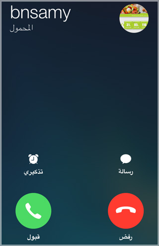

incoming call

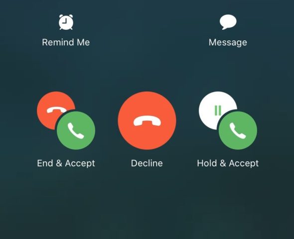
If you've ever received a second call while a call is already in progress, you've probably experienced confusion and anger to decide what to tap because Apple throws a bunch of emoticons in your face making your decision even more confusing.


iPhone users' opinions

One user says, “This is the most confusing thing ever and I always end up with the wrong person,” while another adds, “My heart rate speeds up just by looking at this interface.” And there are those who point out that it is easier to defuse a bomb than figuring out what to press in The second incoming call screen on the iPhone.

There may be criticisms about that screen but there are a lot of dissenting voices as well with one Twitter user saying "the icons are really easy to understand on the screen" while another said "it literally says what the icons do under it you can't read it yourself".

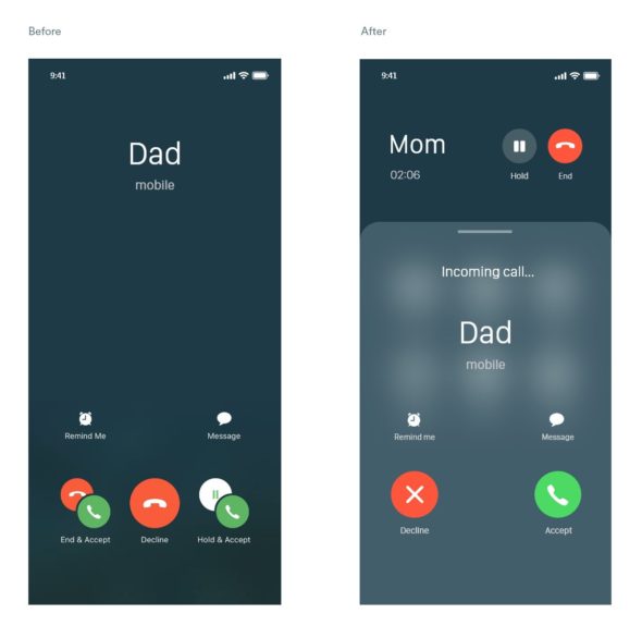
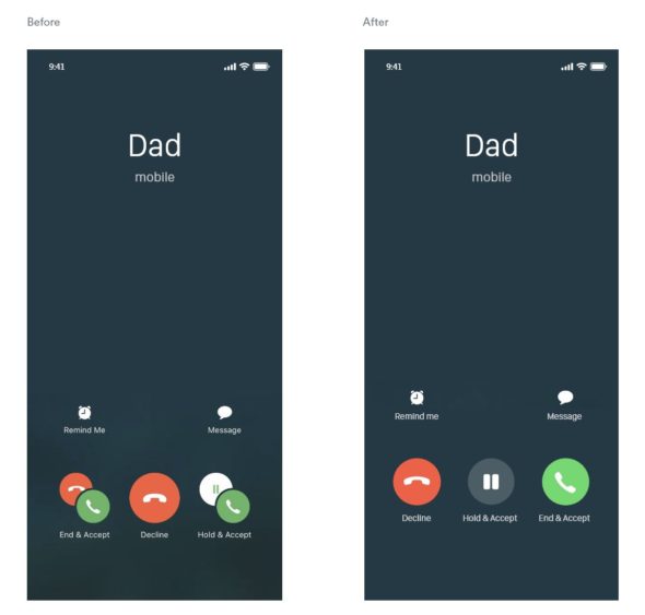
For me, I see that the screen is not the simple, smooth design that we are accustomed to from Apple, where you feel that there is something unclear about these icons. However, Apple can easily re-design the call screen, especially since some users have provided designs inspired by their imagination about how Apple can improve The second call interface.


Finally, Apple products are always smooth, simple and have a great design thanks to their team of designers who focus on building something they want to use themselves, ensuring its beauty and genius, but sometimes there are designs that are not perfect as with the second call screen but arguably worse Apple designs the Magic Mouse 2.

Do you feel that the second call screen is causing you some confusion and not easy, tell us in the comments.

Source:

creativebloq

49 comment

comments user
Ibrahim Salah

Really very confusing
please find a solution

comments user
Bahaa Al-Salibi

It is clear and understandable, but its problem is that you cannot turn the phone on your face if you intend to neglect the second call (you neglect it, meaning you do not answer or reject it). What he sees is suitable for him, and you respond at the time you see fit, but here the screen is full of options, and if you miss and return to follow your first call, it is possible that when the phone touches your cheek, he chooses something according to the location of the touch on the screen.
Frankly, because of this problem, I canceled the wait, so that I do not have to hold the first call or reject the second call
There should be an option for his name
ignore
So that the second caller keeps on waiting until you end the original call without holding
or
Decline

comments user
Hatem Ammar

So confusing and silly

comments user
s999

one glow

comments user
David

The first call screen is what I really like
How to answer the call is sometimes right, sometimes left, sometimes up!

comments user
Mohammed

There are those who say that the mouse is designed like this to force you not to use it in wired mode

comments user
Abu Dunya

What's confusing is that if I'm on a call with someone and someone is next to me and they point at me or talk to me, it confuses me. In order to understand what they're saying, I have to put the call on hold and pay attention to what they're saying because the human brain can rarely do two things that require concentration at the same time.
And so it is with Apple notifying a second call while I'm immersed in a first call that got all my attention.

comments user
Nasser Al-Ziyadi

😁

comments user
adil

Thank you for this nice topic

comments user
Brave heart

Really confusing because I need to read the options every time الخيارات

comments user
Mourad Djetoui

Really confusing

comments user
Ahmed iPhone

I still don't understand why people hate Magic Mouse so strongly
Why
It looks awesome, I use it on a daily basis
+ Who says because the charger is located under
You see, you only need to charge it once every three months
And if it ends with you while you work, this is almost impossible
A minute or half a minute charge is enough to get your job done
Ride it and I will buy you a cup of tea or coffee and come back to it

comments user
nawaf

Thanks for the great article 🌹

comments user
VIP_33

Really confusing and confusing to the user
(it could have been better)

comments user
𝐀𝐛𝐛 𝐡

Normal

comments user
Rayan

I find it simple and clear 👍🏻

1
1
comments user
shaheer al-enezi

When you look at the icons without reading what has been written, it may seem really confusing, so I say it is confusing for those who do not read, and this is normal, as Arabs do not read!

comments user
Abdulrahman

really confusing

comments user
amhed

Thank you for this nice topic
Thank you effort

comments user
Meshaal Al Maamari

Confusing the first time and far from normal
Regarding the mouse, I have been using it for years, and I have no problem with the place of shipment, because I don't mind charging it a lot. Once every three months I charge it almost

2
1
    comments user
    Ahmed iPhone

    Exactly like what I said about the mouse 😂
    Terrible but I don't know why hate

comments user
Moka

yes confusing

comments user
Saeed Obaid

For me, the screen is clear and the options are logical. 1- End the ongoing call and start the incoming call. 2- Continue the current call while notifying the caller that you are busy with an ongoing call. 2- Put the ongoing call on hold and start the incoming call. Fourth, the option to ignore the incoming call. I don’t know the reason for the criticism.

4
1
comments user
Faisal

I find it a bit confusing but I've never gone wrong with it.

comments user
Abu Khaled

Agree with the majority of the worst interfaces two-way call and difficult to understand and confusing as if you are facing a complex math problem سأل

comments user
iMuflh

The interface raises pressure and raises anxiety, although I try to control the subject or avoid the incoming call until the end of the other call, is there a tool in Cydia to change this interface?

4
1
comments user
Khaled

The interface really needs to be changed because it's confusing

comments user
Ahmad ali

“And there are those who indicated that defuse the bomb is easier than knowing what to press on the screen of the second incoming call on the iPhone.”

Really

4
1
comments user
Muhammad Allhanafi

Really the worst need

5
2
comments user
Aslam Albaluoshi

needs to be changed

4
1
comments user
Bin Yemen

And God is really confusing

4
2
comments user
Sherif Al-Sherif

On the contrary, it is very clear
It has 3 options
1- Reject the incoming call (in the middle)
2- Receive incoming and put current on hold (right)
3- Receive the incoming and end the current call (left)

3
2
comments user
Ayman Refaat

Yes, we are not used to this confusion from Apple, except for the latest updates

5
2
comments user
COPPER

Yes, everything that was said about the bad interface on the iPhone is true. I personally suffer a lot in this regard 😢 It is known that a person can get used to the most difficult things in a short time, but honestly, this is the only thing that I have not been able to get used to so far

comments user
Walid Abdelrahman

Without exaggeration, I was not once able to press the correct button when this screen appeared to me 😂

comments user
Ayad

Really confusing
The other annoying thing is that the person calling at this hour does not know that I am making another call

14
2
comments user
Mohamed Alharasi

We wish Apple in the next update to fix receiving calls during previous conversations

6
1
comments user
ابراهيم

Really confusing and unprofessional screen

6
1
comments user
Mohamed Tawfik

On the contrary, it is very clear and understandable
It's very simple

8
9
comments user
may God bless you

Why did you remove the comments from under the article? You have to open a second page to see and write a comment

6
1
comments user
Mohammed Saleg

It is really very confusing and I have to study it before I choose so as not to make a mistake

4
1
comments user
Ahmad

Every time I get a call I go back to reading the book every time because I'm confused by the riddle that says Decode Da Vinci 😂😂😂😂

7
1
comments user
Abu Zaynab

Always misspelled on the screen

9
1
comments user
Bo 3throom

confusing and annoying

6
1
comments user
Abu Tameem

I find it easy, clear and provides a beautiful service

5
7
comments user
Yahya

It really is a bit confusing..
Always hang up on the first caller.
Also, for those who are a perfect person and comment the first and answer the second, and for those who want to return to the first call, you feel that you are the stupidest person on the face of the earth, although the step is very easy 😁😁

11
1
comments user
Mohammed Al Sayed

Really confusing

7
2
comments user
advantage

Although what is written under the symbols is clear, the image in general makes you feel that it is designed for other than the iPhone 😂 it has a strange amount of confusion even if I know the meaning of the symbols, and this is contrary to the comfort in the rest of the interfaces of the iPhone pages

13
2
comments user
Ali Taha

I agree with you - the design is confusing and unclear

21
1

Leave a response

We are not responsible for any misuse of the information mentioned above. IPhone Islam is neither affiliated nor represented by Apple. IPhone, Apple and any other product name, service names or logos referenced herein are trademarks or registered trademarks of Apple Computer.

العربية简体中文NederlandsEnglishFilipinoFrançaisDeutschΕλληνικάहिन्दीBahasa IndonesiaItaliano日本語한국어كوردی‎فارسیPolskiPortuguêsРусскийEspañolTürkçeУкраїнськаاردوTiếng Việt